Well, here's my animation, as finished as possible. There is a lot more I want to do with it, but I'm nearly out of time.
Showing posts with label 3D Animation Project. Show all posts
Showing posts with label 3D Animation Project. Show all posts
Sunday, 2 November 2014
Saturday, 1 November 2014
3D Animation Project: Window
Making a mesh transparent for a window was really simple. It just required ticking transparency on the material. However, I wanted my window to be slightly clouded, just so it would be easier for the eye to pick up.
Thus I added a texture under 'Color'. I settled on water, but had considered using metal. Here are the settings I used:

Top: Water
Bottom: Metal
I chose water because I felt it fitted better with the colour scheme, but looking at these now, I think metal looks better.

And here is a comparison of no window and window:

One problem I had with this scene was that when it was finalised and rendered, the beginning shot of the planet was jarringly quick. I tried moving all the keyframes along in the animation in order to create room on the timeline to extend the shot at the beginning, but that completely messed up the cape.
So I had to delete everything but the planet and camera. I then animated the planet so it rotated and ended in the position it was in at the beginning of the window scene. Then in After Effects I put this one key behind the window scene, so that it would rotate and smoothly transition into the window scene, effectively extending it by about 3 seconds.
I had also tried combining the first scene with the second scene, by merging them both in Cinema4d. So it would start here at the exterior of the building...

...then zoom in on the earth...

...and then zoom back out into the interior of the building, all in one smooth camera movement...
.jpg)
However, I ran into the problem with the cape again. It seems that once it was keyframed, it couldn't be moved, or it just glitches all over the place.
Friday, 31 October 2014
3D Animation Project: Openings and endings
Initially, I had the poster in Cinema4d. However, once rendered, the poster moved too quick to read. There was too many objects and keyframes to move them all along the timeline to give more space to slow down the poster, so I decided to remove it from Cinema4d and add it in After Effects.
.png)
.png)
I made these to fit with the old style and colour scheme. However, I decided not to change it in order to reinforce the difference between the advertised property and the reality.

For the scene at the top, I simply took a screenshot from Cinema4d and used a filter in Photoshop to make it look more like a painting. I chose the font because it looks kind of futuristic, but isn't obscure or too over the top.
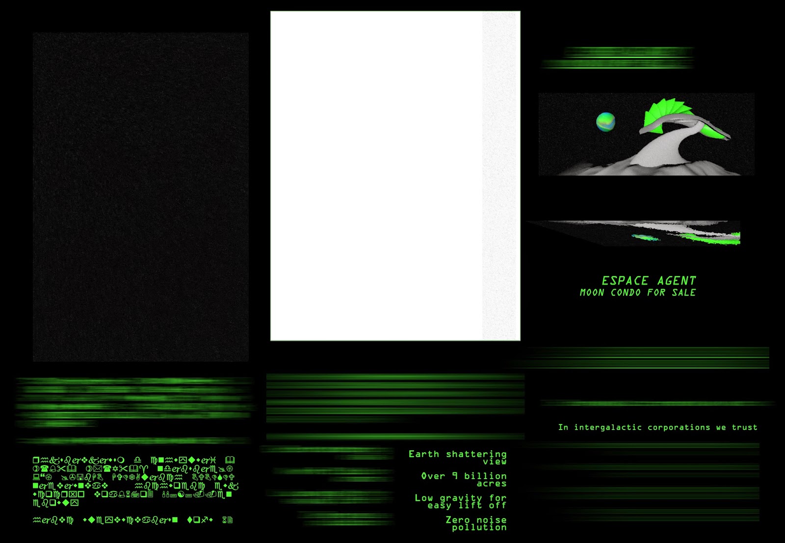
To make the transparent green things, I used motion blur on the text. I then stretched the result vertically

For unity I used the same black background, font and colour from the poster, for the end screen. This screen was made entirely by copy, pasting, resizing and rotating bits and pieces from the poster above.


Ultimately, In the actual animation I removed the black background, to have a smoother transition:

3D Animation Project: Animatic
This is a quick animatic I made with my storyboard in order to get an idea of the timing. I felt the alien moved a bit too slow in this, so I knew I had to make it move faster in the actual animation. However, I think I made it a tad to fast in the end.
Thursday, 30 October 2014
3D Animation Project: Textures Update
At this point, the building and the ground were textured with a block colour.

At this point, everything has textures, albeit, minimal ones.
To make the stars I generated some noise, and then adjusted the levels so it more resembled a starry sky. Then I created a radial gradient, going from dark green to light green, and placed it on a new layer above the stars. The gradient gives the background some depth. I changed the blending mode to 'Linear Dodge (Add)'.

Then, for the majority of the rest of my objects, I simply took the starry background, used the Smudge Stick filter, and created a layer above it with the 'Linear Dodge (Add)' blending mode again. On this layer I placed a variety off purples and greens to get all the textures I needed.


To make my indoor texture fit the new style, I simply overlayed one of the above textures onto it:

To make my earth texture fit the new colour scheme I simply changed the hue:

For my oil rigs, I simply used the paintings I did for my storyboard. I added them to my animation the same way I did my character, with alphas on a plane:


Once in Cinema4d, I duplicated the plane object and rotated them back to back the make it look 3d. As can be seen here:

And here is the alpha and texture for my aeroplane:


Tuesday, 21 October 2014
3d Animation Project: Render style
This is a pretty plain render, with only Ambient occlusion on:

I really liked the colours in this image that I came across when doing research for my style tile, so I used it as a reference at first.

Started playing around with textures and the Sketch and Toon render setting. I liked this mix of flat 2d and 3d objects, the contrast helping to create depth. This was achieved by simply excluding certain objects from the settings. However, I felt too much detail was lost with this style.

Whereas with the above image, I added the texture in the render settings, in the below image I added the textures directly to the objects and then rendered with Sketch and Toon set to 'Shading' instead of 'Texture'.

I then created some lighter textures and added reflectance so they would have highlights in the render

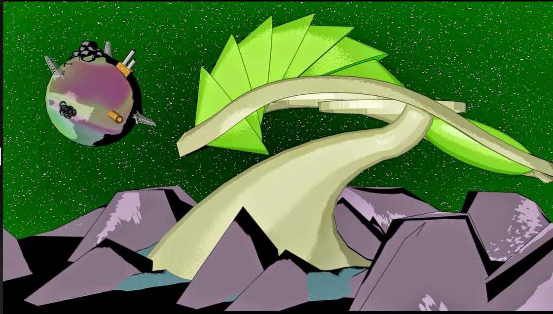
I tried to create a more stylised earth, by making a 'Landscape Object' Spherical, reducing the number of width segments and playing around with the 'Sea Level' and 'Plateau Level'. I really liked how it looked, but it didn't work very well with all the objects(oil drills, chimneys, piles of rubbish/tyres) that I made to litter the earth.

This is the final style I arrived at:

I settled on a sort of sickly colour scheme of greens, purples and pinks. I thought this added an atmosphere of unease, and wrongness.


Another thing I did, was added a Normal to the earths texture, because I felt it looked too flat. Here it is without the normal:

Here it is with a normal of 70%. I thought it looked cool unrendered, but when rendered was too black:

Here it is at 37%:

In the end I settled on 25% which I felt was a good balance.
Tuesday, 14 October 2014
3d Animation Project: Textures
This is the texture I made for my earth object:

Edited the lower layer with the Liquify filter:

Forgot to document the whole process so quickly recreated the technique. Started by making a Linear Gradient. Then went to Filter > Distort > Polar Coordinates and used 'Polar to Rectangular'. Then duplicated the layer and rotated it 90 degrees. Then set the blending mode to 'pin light'.


This is the texture I made for the walls inside the space condo:

Started by filling the background in grey:
.png)
Added an inner glow, with a Rounded Steps contour.
.png)
Duplicated the layer, resized it, and changed the contour to Sawtooth.
.png)
Finished texture:
Added to animation:
.png)
.png)
Subscribe to:
Posts (Atom)