I thought using the brain to display skill levels was a clever idea. I also like how she uses a lightning bolt to contain her text, making it part of the illustration in the bottom half.

These two looks really elegant, and the sparse colouring makes sure all the viewers
attention is not taken away from the writing. In the second image, I like the depth added by the contrasting light and dark lines.


These two make me think of childrens books, and I imagine would endear the applicant to the employer, whilst also showing off their skill and creativity.

I thought this one was really clever and thematic. He is literally selling himself, and shows a good sense of humour and degree of skill. I almost looked over it because it looked so convincingly like an Amazon page. I had to do a double take.

I love the contrast of the colours, and the overall style

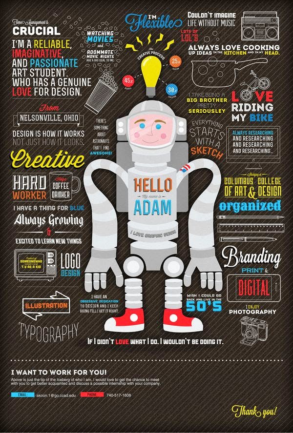
I think this would impress anyone. Obviously a huge amount of effort and skill was involved in the creation of this. I like the idea of using signposts as text boxes. It feels like a really natural way to lay things out. An idea that has just came to me, is to use like an art gallery layout or something. Like use paintings/frames as text boxes. Which would be appropriate for applying to something art and design related.Would be a good way of both displaying my work and laying out the text.

The colours and the illustrations make this one stand out. I like the way she separates the professional and personal information sections with the illustrations.

Unobtrusively demonstrates both drawing and graphic design skills

No comments:
Post a Comment